Saturday, 3 December 2016

FORMATIONS TUTORIAL


Formations are powerful indicators of future price moves. They have been used be traders for many years and play a vital role in technical analysis.


The two most important concepts to understand when looking at graph formations is to be able to identify supports and resistances."


In essence, a support line is a trend line identified on a graph that the share price approaches and then bounces off. A support line is classified after several points displaying this behavior and is comprised of at least two of these points. The easiest way to become familiar with this is through looking at examples which can be seen below.


Similar to the support line is the resistance line. The resistance line is also a trend line however this line represents a barrier that the share price approaches, slows to a halt, and then backs away. It is classified in the same way as the support line in that it is comprised of several points that when linked together form this line. The minimum number of points required is two. The examples below will help to make the concept more familiar.


The Head and Shoulders formation is one of the most used and reliable pattern formations. It is a bearish formation which indicates that the share price is going to move down. It consists of a left shoulder, head, and right shoulder which can be seen in the figure. The shoulders should be relatively equal is size with a larger head in the middle. The base of the Head and Shoulders is called the neck line. This neck line is a support line on which the Head and Shoulders is based. The actual neck line does not have to be horizontal but can be at a slight to moderate angle which is shown in the examples below.

A Head and Shoulders formation target is triggered when the right shoulder finishes forming and breaks the support line. The Head and Shoulders target is worked out by taking the height of the head from its support line and subtracting this from the support line.


The second example shows a further characteristic that is possible with a Head and Shoulders pattern. This is that the pattern can also be comprised of multiple shoulders as long as the shoulders that follow are below the highs of the shoulders directly aside the main head.


In the third example one can see the share price coming back to the support and breaking the support. This happens on occasion with Head and Shoulders patterns. This does not mean that the pattern is discarded. The target is only removed if the share price moves above the right shoulder level.


The Inverse Head and Shoulders pattern follows the same pattern as the regular Head and Shoulders, with a left shoulder, head, and a right shoulder but is flipped about the neckline which can be seen in the diagram below. The Inverse Head and Shoulders is thus a bullish formation


This formation is formed between an ascending support trend line and a descending resistance trend line which forms a triangle shape. The pattern can be either bullish or bearish depending on the breakout point. An example can be seen below. How the triangle formation works is that the share price is bound by the support and resistance and moves between them, at the instance where the share price breaks through either the support or resistance line the target method is applied. If the share price breaks through the resistance trend line the target is bullish. If the share price breaks through the support the target is bearish.

Using the example shown below, the targeting methods will be explained. What is clear is that the share price broke the support line, triggering the bearish target. If it had broken the resistance, the bullish target would have been triggered."
The first method that will be discussed is the triangle height method. How this method works is you move to the starting point of the trend line (either the support or resistance line) that is furthest right, thus in the case of the example it is the resistance line, and you take the vertical distance between the support and resistance line at this point and either add it to the resistance line break out point or subtract it from the support line breakout point depending if it is a bullish or bearish breakout. If the share has broken the resistance line then it is added to the break out point. If the share price has broken the support line then the distance is subtracted from this point
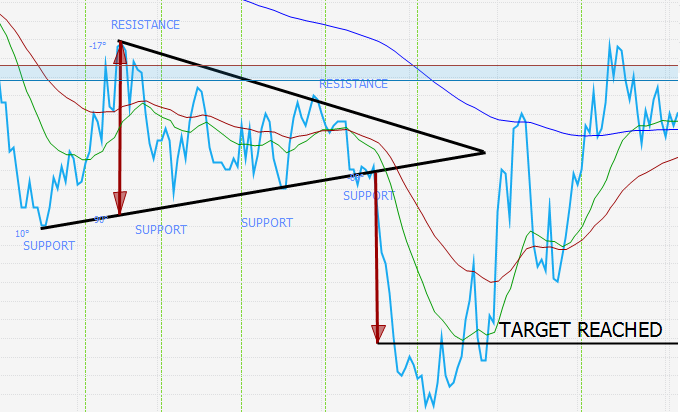


The second method is the parallel line theorem. This is a slightly more technical method but once understood is very easy to implement. Firstly the break out needs to be identified - either bullish or bearish. If the beak out is bullish, a line parallel to the support is drawn from the starting point of the furthest right trend line in the same way that was done for the first method. If the breakout is bearish, as seen in the example, a line parallel to the resistance line is drawn. A vertical line is drawn from the breakout point to this parallel line and the point at which they intersect is the target


This is a triangle formation where the resistance is a horizontal line and the support is an increasing bullish trend line. The share price moves between these two lines until it either breaks through the support or the resistance. This formation is a bullish formation and a break of the resistance will trigger upward movement."
The target method for this type of formation is as depicted in method 1 under the symmetrical triangle formation tab. As this example is a bullish breakout, the vertical distance from the furthest right trend line, in this case the resistance line to the support line, was taken and added to the breakout point of the resistance line. The target was then reached.


This is a triangle formation where the resistance is a descending gradient bearish trend line and the support is a horizontal trend line. The share price moves between these two lines until it either breaks through the support or the resistance. This formation is a bearish formation and a break of the support will trigger downward movement. 


The target method for this type of formation is as depicted in method 1 under the symmetrical triangle formation tab. The vertical distance from the furthest right trend line, in this case the resistance line to the support line, was taken and subtracted from the breakout point of the support line. The target was then reached.


The ascending channel is when the share price moves between a support and resistance line, both with an increasing trend line. Once the support and resistance entities have been established, traders can make use of this technique to trade between the support and resistance bounds. Instances when the share price approached the support triggered stock purchases and instances when the share price approached the resistance triggered stock sells. An example can be seen below, where this methodology would have worked well.


The descending channel is when the share price moves between a support and resistance line, both with an decreasing trend line. Once support and resistance entities have been established, traders can make use of this technique to trade between the support and resistance bounds. Instances when the share price approached the support triggered buys, and when the share price approached the resistance triggered sells. An example can be seen below where this methodology would have worked well.


A falling wedge is a bullish reversal pattern. It can be described as a cone like shape with a resistance and support line with a negative gradient that converge on one another. The share price moves between the support and resistance lines and if the share price breaks through the top resistance line the formation target is triggered. The target method is very simple as it is to the start of the resistance line, this can be seen in the figure below.


A rising wedge is a bearish reversal pattern. It can be described as a cone like shape with a resistance and support line with a positive gradient that converge on one another. The share price moves between the support and resistance lines and if the share price breaks through the bottom support line the formation target is triggered. The target method is very simple as it is to the start of the support line, this can be seen in the figure below.


Sunday, 27 November 2016

CHARTS POST 1


JSE WHL


WHL Weekly Chart


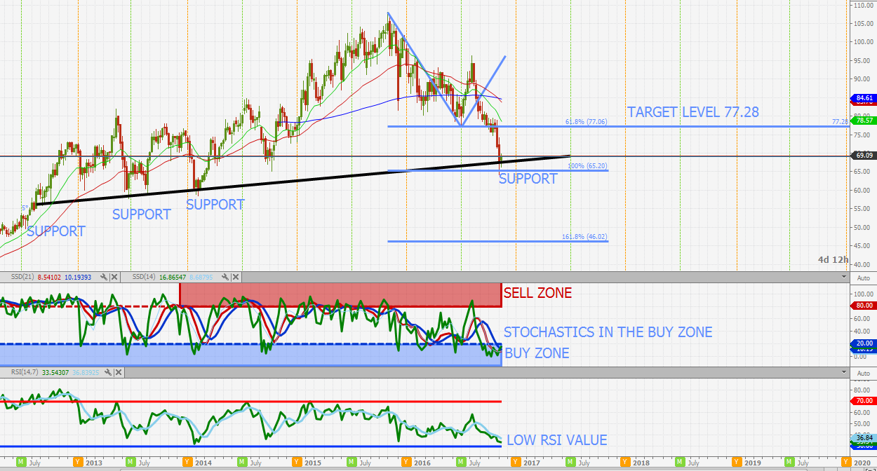
WHL like most of the JSE retailers has seen a significant sell off in the last few weeks. Looking at both the daily and weekly charts the share is showing to be highly oversold. Looking at the weekly stochastics it is apparent that the stochastics are grouped in the buy zone with a bullish intersection. The weekly share price has also now tested the long term support level and reached the 100% extension level. Looking at the final two weekly candle sticks a piercing line pattern can be identified with tails showing buyers coming in to hold the price up.The P/E is also histrionically relatively low at 15.13. As long as the share holds above  65.20 the chart is looking bullish


JSE NPN


JSE NPN Weekly chart


NPN is another share that has seen a significant pull back to its ultra long term trend line. The daily and weekly charts are very oversold with a weekly bullish intersection on the fast stochastic. Will look to go long and remain bullish above a weekly close of R1987. The last 2 candle sticks also depict a classic reversal formation . Targets are as seen in the graph.


JSE REI


JSE REI Weekly chart


Another share that is seriously oversold! Looking at the weekly chart the stochastics are heavily grouped in the buy zone and the RSI is showing a bullish cross with its moving average. The share price its self has also pulled back to the significant double support intersection level at R26.50. A close above the 200MA will confirm this bullish sentiment. Target 1 is to the 200MA level at R28.07 above this and target 2 is R29.15 and target 3 is R30.92


JSE NPN


JSE REI Weekly chart


Another share that is seriously oversold! Looking at the weekly chart the stochastics are heavily grouped in the buy zone and the RSI is showing a bullish cross with its moving average. The share price its self has also pulled back to the significant double support intersection level at R26.50. A close above the 200MA will confirm this bullish sentiment. Target 1 is to the 200MA level at R28.07 above this and target 2 is R29.15 and target 3 is R30.92


SILVER A COMMODITY TO WATCH 


When looking at sectors/shares/commodities that could be strong to the future one of my picks is silver. We all know that the world is becoming more conscious of promoting clean energy and moving away from fossil fuels. Bellow is an extract from a website discussing silvers use in solar energy. 

"What many don’t know is that silver is a primary ingredient in the photovoltaic cells that catch the sun’s rays and transform them into energy. 90 % of crystalline silicon photovoltaic cells (the most common cell) use silver paste and close to 70 million ounces of silver are projected for use by solar energy by 2016." - https://www.silverinstitute.org/site/silver-in-technology/silver-in-green/solar-energy/

Silver is currently trading well off its all time high of 50.00. Although the share has seen some significant movement in the last couple of days the large inverse head and shoulders full target has not been reached. The chart is in a hard state to reach for a very accurate buy level, but at around 19.14 I think it is looking good. First target there after is 21.89. For long term buyers that like silver 19.14 is looking like a good level.

JSE CFR


CFR Weekly Chart

One of the JSE top blue chips stocks CFR has not been performing well for a number of weeks now. Looking at the chart the next support level is looking to be 76.80. At this point the share will be extremely oversold and will be looking good for a buy. Both indicators are also in the buy zone.


JSE SBK


SBK Daily Chart

Target set has now been reached and the share is looking bullish once again.

JSE SBK Daily Chart


Share price failed to break out of the ascending channel with the resistance level holding. The share price now looks to be retracing back to the channel support. The target level is the channel support and 200MA level of R130.91. After the target level is reached the outlook is bullish with a large gap still open between R144.55 and R147.77. Looking at the P/E the share is trading at a relatively low value of 9.56 when compared to its historical P/E value.

Copper Chart


Copper Daily Chart.


The Copper price has seen movement to re-test the support and is forming a nice consolidation at this level. Looking at the bigger picture the Copper price seems to be in the process of forming a large bullish inverse head and shoulders pattern. Looking at the indicators they to are confirming this bullish sentiment with the stochastics in the buy zone and the RSI showing a bullish cross with its moving average. As long as the support holds the target levels show in the graph will remain.


JSE VOD


VOD Daily Chart

After seeing a significant pull pack VOD is now starting to look bullish. The share has pulled back to the support level and looks to have held. A close above the 200MA will be the confirmation of the trend change. Looking at the indicators they are showing that the share is very oversold. A hold above the support level will target the 2 levels shown in the graph.


JSE IMP


IMP Daily Chart

Full target has been reached. Looking at the chart now the share is looking to be potentially bullish with the candle sticks pulling back to the ascending support level and showing a consolidation. As long as this support level of 59.29 holds the bullish target of 70 will remain. It must be noted however that the stochastics are not yet grouped in the buy zone but the RSI is looking to be wanting to intersect with its moving average forming a bullish crossover.


   JSE IMP Daily Chart

   The share price just a few cents off the first target.


JSE IMP DAILY CHART


The plat shares have had an unbelievable rally in the last couple of days. However, IMP is now looking very overbought and looking due for a pull back. The share price is testing the resistance level shown with the last 2 candles resembling a classic reversal. When looking at the indicators they are supporting this with the stochastics heavily grouped in the sell zone as well as a very high RSI value with a bearish cross. The target level is shown in the graph.


Saturday, 19 November 2016

JSE TOP40 Trajectory algorithm 30 day forecast


JSE TOP40 Trajectory algorithm 30 day forecast

Will start posting more of these more frequently. If you would like a brief description of how this is derived please see the forecasting tab. In short this is an objective mathematical analysis of the trend and seasonality in price of and index or share. The program uses this to analyse what these numbers and indicating to and using that to build a share price forecast. Will also upload a Top40 technical analysis.

Trajectory Forecasting algorithm

Background
This model was developed as a by product of a project that I was working on for a health care company specializing in hospital care. At the company I was investigating the optimal way to allocate nurses in hospitals to minimize cost to the company, as well as provide adequate care to the patients. During this process the idea for the trajectory algorithm was developed. 
Basics of how its works
The model makes use of mathematical formulas to identify trend and seasonally in number patterns. The algorithm is allowed to use 56 variables all affecting the output in different ways. The algorithm runs selecting the number of variables and the sizes of each dynamically over iterations to arrive at a final answer. 
What you need to know 
What must be stated is that this model is no guarantee nor is it claiming to predict the future. Its purpose it to provide an objective trajectory forecast based on past numerical data. 
The orange line is the actual index value movement for the last 250 trading days.
The blue line is the forecasted index value for the last 250 trading days. The point at which the orange line stops is where the forecast model starts its prediction for the next 30 trading days.
The green line is half a standard deviation of the index subtracted from the forecast data with a 6 day moving average. likewise the red line is the standard deviation of the index added to the forecast data with a 6 day moving average. 

Combined the top and bottom standard deviations are referred to as the "cloud" and once the 30 day forecast starts the standard deviations are referred to as the "forecasting cloud". This cloud is a confidence band that gives the user an absolute range in which price movement should occur. In periods of lower volatility the cloud will be narrower and in periods of high volatility the cloud will widen.


FTSE100 & JSE ALLSHARE index correlation 

This post looks at what the correlation is between moves on the FTSE100 and the JSE ALLSHARE to see if there is any links in how these indecies move.


 The first set of data that was looked at is seen above. 613 days of correlated trading on the FTSE100 and JSE ALLSHRE was used. The data was compared and two cases were assessed. These cases were: what is the correlation between the FTSE100 closing up and the JSE ALLSHARE also closing up, and what is the correlation between the FTSE100 closing down and the JSE ALLSHARE also closing down. 
The data was compiled and the results showed that on a day that the FTSE100 closed up, there was a 71.84% correlation that the JSE ALLSHARE also closed up. The same was done for the case of the FTSE100 closing down on a particular day and the JSE ALLSHARE also closing down which showed a 69.15% correlation.


The mean, standard deviation and correlation coefficient was also calculated for the days of correlated trading for the indices and the results can be seen above. The mean for the percentage movements for both indecies was very similar with the FTSE100 mean percentage movement coming to -0.01% and the JSE ALLSHARE coming to 0.03%. The Standard deviations were also similar with the FTSE100 equaling 0.98% and the JSE ALLSHARE equaling 0.99%.

The last set of analysis is the set up of a probability curve for analysing movements on the FTSE100 and the historical correlation of what would happen on the JSE ALLSHARE. The Y-axis is the confidence band this is the value that is added and subtracted to the percentage move on the FTSE100. The X-axis is the probability axis. 


How to use this curve is simple. The move on the FTSE100 is taken e.g. FTSE100 is up 0.5%. Then the user chooses the confidence band on the Y-axis (percentage deviation) for this example 0.8% is chosen. Then move across the Y-axis until you intersect with the curve and then move vertically down until you intersect with the X-axis and this is you probability. For this example the 0.8% confidence band chosen is subtracted from the 0.5%  move on the FTSE100 (= -0.3%) and the probability is attained using the curve. Moving across from 0.8 on the Y-axis the result is that there is a 71.6% probability that the JSE ALLSHARE closes above -0.3% based on the historical correlation between the FTSE100 and JSE ALLSHARE.

Saturday, 8 October 2016

Moving Averages and the Stochastic Indicator


A moving average is a trend that is applied to the stock data which represents an average of the share price points for specified periods. The primary functions of a moving average is to analyze the trend and momentum of the share price and to indicate to the user certain buying and selling opportunities. Because the moving average takes a certain number of periods and applies and average to them it is what is known as a lagging indicator as it confirms trends and is not used to predict them. The basic application is similar in a sense to the stochastic indicator which is previously discussed as seen in the menu. 

By looking at the example below lets establish the basics regarding the moving average. Below one can see a blue line that follows the share price, this is the moving average. Similar to the stochastic logic with a moving average on an upward trend when the candle sticks or line chart is above the moving average then the upward momentum of the share price is increasing. likewise if the share price is trading below the moving average then the upward momentum is decreasing. The same logic also applies to downward trends. 

When the candle stick or line chart is trading below the moving average then the momentum downwards is increasing relative to the moving average. If the share price is trading above the moving average then the momentum downwards is decreasing relative to the moving average.


There are three types of settings that will be covered. The 21 and 50 period settings and the very important 200 period moving average. The first setting combination to be discussed is the 21 and 50 period moving average combination. This moving average combination is used to identify potential entry and exit points. Simply, this method covers less periods than the 50 period moving average and is thus more sensitive. This means that it will be a faster acting indicator. The 50 period moving average will be a slower acting indicator and is less sensitive to price fluctuation. Now combining these two indicators can be a powerful method for determining trades. The example below is a pictorial representation of this method.


When the blue line (21 period moving average) is above the red line this indicates that the momentum is moving upwards thus an increasing share price. Likewise when the blue line is below the red line this indicates that the momentum is moving downwards thus indicating a decreasing share price. The way these are used is to look at the points at which these two indicators cross over one another. This can be seen in the example at the red and blue buy and sell signal lines. When the blue line moves from below the red line and crosses the red line this is an indication of a potential buy. When the blue line moves from above the red line and crosses the red line this indicates a potential sell. As one can see in the graph the timing of the signals was not always optimal but if one had traded according to this indicator method one would have been highly profitable. If one had gone long on all the buy signals and shorted on all the sell signals the profit would have been 49% in 572 trading days where as holding the share for the entire period would have produced a -4% return. This shows that this method can be highly effective even if it is just used on its own, but combining this method with the other technicals shown on this site can create a highly effective trading strategy.


The relative strength index is a technical indicator that measures a shares momentum. It measures a shares current strength to its historical price movements and uses the share prices closing data. Similarly to the stochastic this indicator gives a measure of the overbought and oversold conditions of a share. It too is also bounded between 0 and 100. A share is usually considered oversold on the RSI when its value is below the 30 mark on the vertical axis. A share is considered overbought on the RSI when its value is above the 70 mark on the vertical axis. The RSI can display a lot about a shares price further than the overbought and oversold conditions which will be discussed later on.


One of the applications of this indicator is when the RSI moves below the 30 mark or reaches a RSI low on the vertical axis this triggers a buying signal to the trader. Likewise if the RSI is above the 70 mark or has reached an RSI high on the vertical axis this triggers a selling opportunity to the trader. The 30, 70 lines are the general settings however these values are not set in stone and can be changed to accommodate a certain share  An example of the 30, 70 line application can be seen below.


As with the previously discussed stochastic indicator a moving average can also be applied to the relative strength index indicator. The application is the same as with the stochastic indicator. For the example shown below a 14 period relative strength with a 7 period moving average was chosen which gives accurate trade entries and exits. Furthermore for this share the overbought bound was changed from 70 to 64 and the lower bound to 34 from 30. This was done as the share rarely reached the standard bound settings and historically the new bounds were shown to give a better indication. To recap the method, when the RSI moves from below the moving average and intersects the moving average underneath the 34 mark on the vertical axis this indicates points of trade entry. When the RSI moves from above the moving average and intersects the moving average above the 64 mark on the vertical axis this indicates a sell point. The application of this is shown below.