
JSE WHL
WHL Weekly Chart
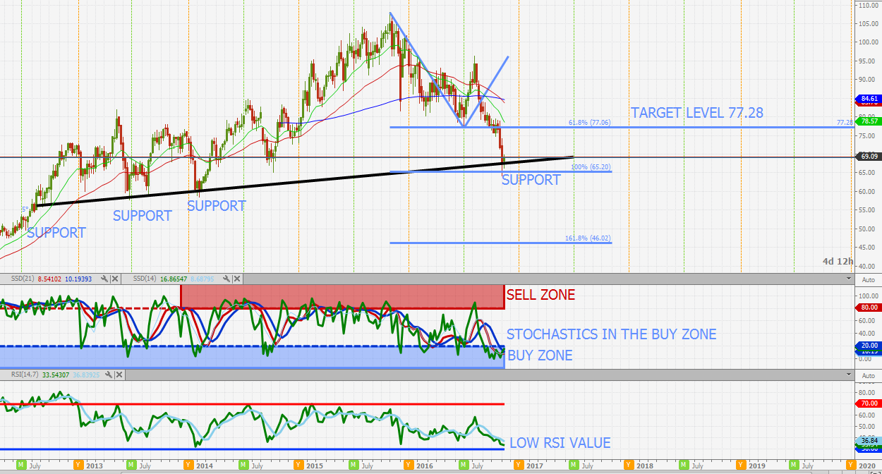
WHL like most of the JSE retailers has seen a significant sell off in the last few weeks. Looking at both the daily and weekly charts the share is showing to be highly oversold. Looking at the weekly stochastics it is apparent that the stochastics are grouped in the buy zone with a bullish intersection. The weekly share price has also now tested the long term support level and reached the 100% extension level. Looking at the final two weekly candle sticks a piercing line pattern can be identified with tails showing buyers coming in to hold the price up.The P/E is also histrionically relatively low at 15.13. As long as the share holds above 65.20 the chart is looking bullish
JSE NPN

JSE NPN Weekly chart
NPN is another share that has seen a significant pull back to its ultra long term trend line. The daily and weekly charts are very oversold with a weekly bullish intersection on the fast stochastic. Will look to go long and remain bullish above a weekly close of R1987. The last 2 candle sticks also depict a classic reversal formation . Targets are as seen in the graph.
JSE REI

JSE REI Weekly chart
Another share that is seriously oversold! Looking at the weekly chart the stochastics are heavily grouped in the buy zone and the RSI is showing a bullish cross with its moving average. The share price its self has also pulled back to the significant double support intersection level at R26.50. A close above the 200MA will confirm this bullish sentiment. Target 1 is to the 200MA level at R28.07 above this and target 2 is R29.15 and target 3 is R30.92
JSE NPN
JSE REI Weekly chart
Another share that is seriously oversold! Looking at the weekly chart the stochastics are heavily grouped in the buy zone and the RSI is showing a bullish cross with its moving average. The share price its self has also pulled back to the significant double support intersection level at R26.50. A close above the 200MA will confirm this bullish sentiment. Target 1 is to the 200MA level at R28.07 above this and target 2 is R29.15 and target 3 is R30.92
SILVER A COMMODITY TO WATCH

When looking at sectors/shares/commodities that could be strong to the future one of my picks is silver. We all know that the world is becoming more conscious of promoting clean energy and moving away from fossil fuels. Bellow is an extract from a website discussing silvers use in solar energy.
"What many don’t know is that silver is a primary ingredient in the photovoltaic cells that catch the sun’s rays and transform them into energy. 90 % of crystalline silicon photovoltaic cells (the most common cell) use silver paste and close to 70 million ounces of silver are projected for use by solar energy by 2016." - https://www.silverinstitute.org/site/silver-in-technology/silver-in-green/solar-energy/
Silver is currently trading well off its all time high of 50.00. Although the share has seen some significant movement in the last couple of days the large inverse head and shoulders full target has not been reached. The chart is in a hard state to reach for a very accurate buy level, but at around 19.14 I think it is looking good. First target there after is 21.89. For long term buyers that like silver 19.14 is looking like a good level.

JSE CFR

CFR Weekly Chart
One of the JSE top blue chips stocks CFR has not been performing well for a number of weeks now. Looking at the chart the next support level is looking to be 76.80. At this point the share will be extremely oversold and will be looking good for a buy. Both indicators are also in the buy zone.
JSE SBK

SBK Daily Chart
Target set has now been reached and the share is looking bullish once again.

JSE SBK Daily Chart
Share price failed to break out of the ascending channel with the resistance level holding. The share price now looks to be retracing back to the channel support. The target level is the channel support and 200MA level of R130.91. After the target level is reached the outlook is bullish with a large gap still open between R144.55 and R147.77. Looking at the P/E the share is trading at a relatively low value of 9.56 when compared to its historical P/E value.
Copper Chart

Copper Daily Chart.
The Copper price has seen movement to re-test the support and is forming a nice consolidation at this level. Looking at the bigger picture the Copper price seems to be in the process of forming a large bullish inverse head and shoulders pattern. Looking at the indicators they to are confirming this bullish sentiment with the stochastics in the buy zone and the RSI showing a bullish cross with its moving average. As long as the support holds the target levels show in the graph will remain.
JSE VOD

VOD Daily Chart
After seeing a significant pull pack VOD is now starting to look bullish. The share has pulled back to the support level and looks to have held. A close above the 200MA will be the confirmation of the trend change. Looking at the indicators they are showing that the share is very oversold. A hold above the support level will target the 2 levels shown in the graph.
JSE IMP

IMP Daily Chart
Full target has been reached. Looking at the chart now the share is looking to be potentially bullish with the candle sticks pulling back to the ascending support level and showing a consolidation. As long as this support level of 59.29 holds the bullish target of 70 will remain. It must be noted however that the stochastics are not yet grouped in the buy zone but the RSI is looking to be wanting to intersect with its moving average forming a bullish crossover.

JSE IMP Daily Chart
The share price just a few cents off the first target.

JSE IMP DAILY CHART
The plat shares have had an unbelievable rally in the last couple of days. However, IMP is now looking very overbought and looking due for a pull back. The share price is testing the resistance level shown with the last 2 candles resembling a classic reversal. When looking at the indicators they are supporting this with the stochastics heavily grouped in the sell zone as well as a very high RSI value with a bearish cross. The target level is shown in the graph.


